ESHINE
宇晟 | Brand strategy positioning&Brand image building
ESHINE
Project background
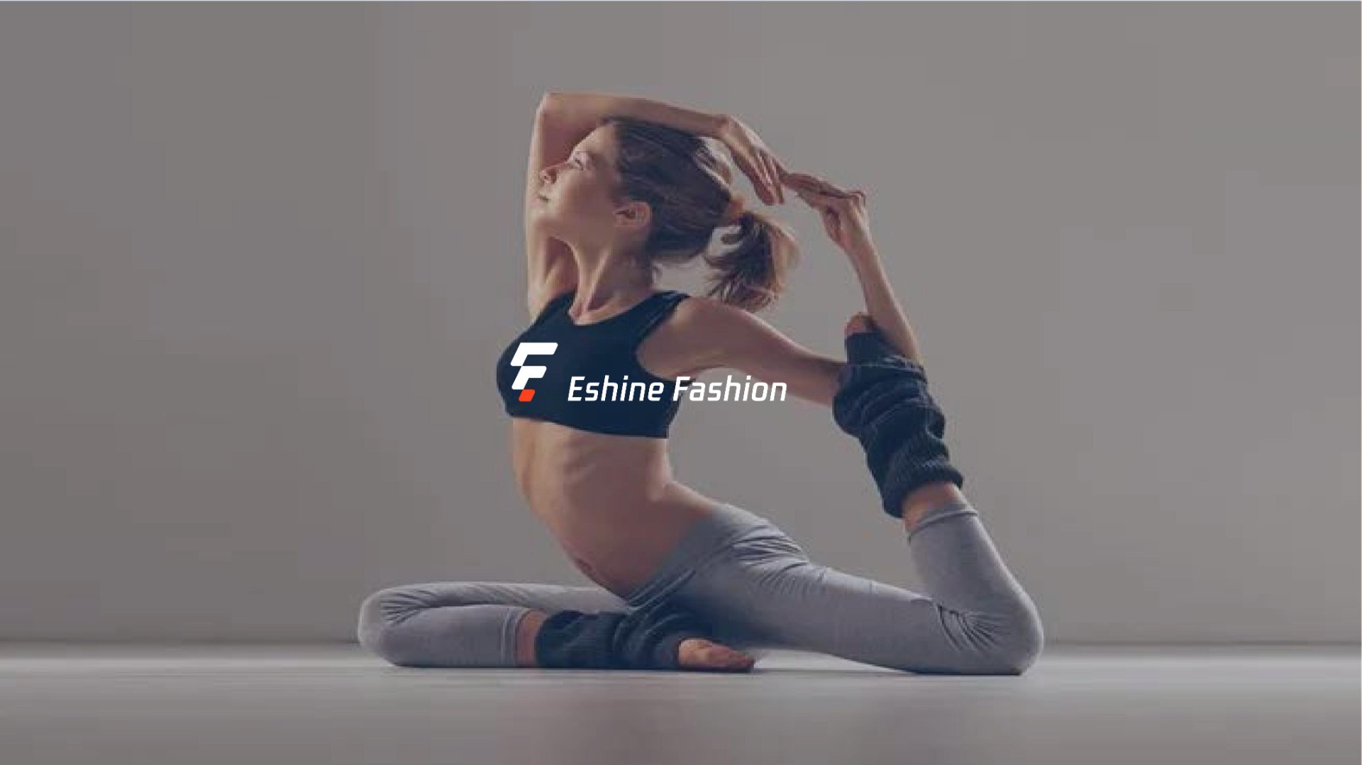
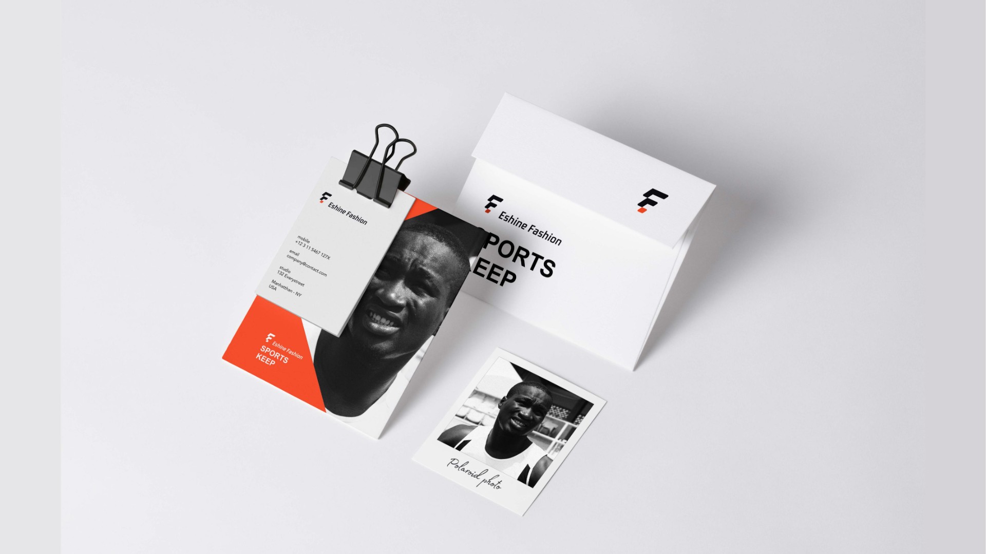
以企业英文首字母"EF”为创意出发点,采用方形表示透气孔,寓意服装舒适透气。采用15 度倾斜角设计,体现出运动的动感,选用黑色和橙色两种颜色彰显企业高级时尚。
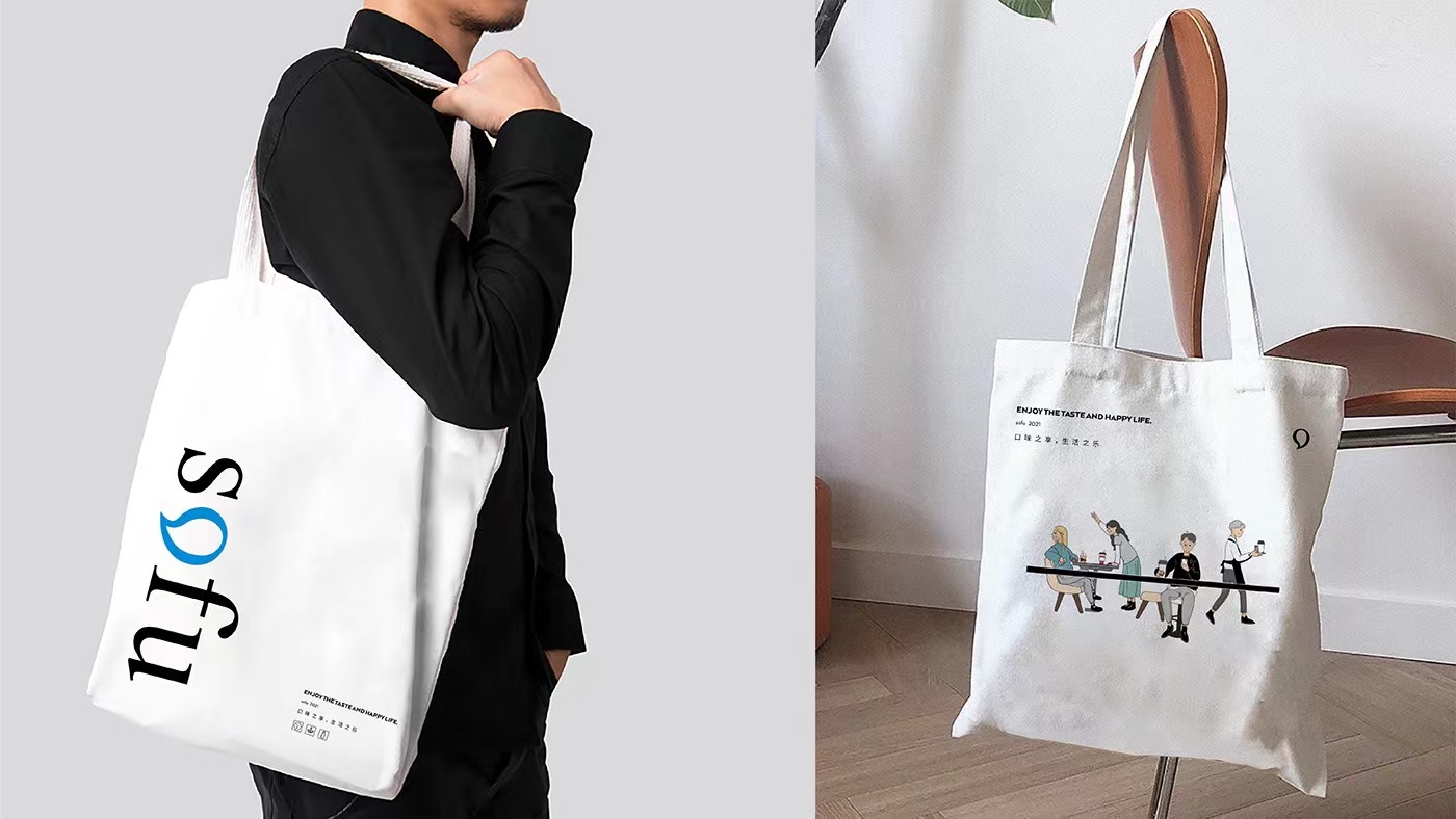
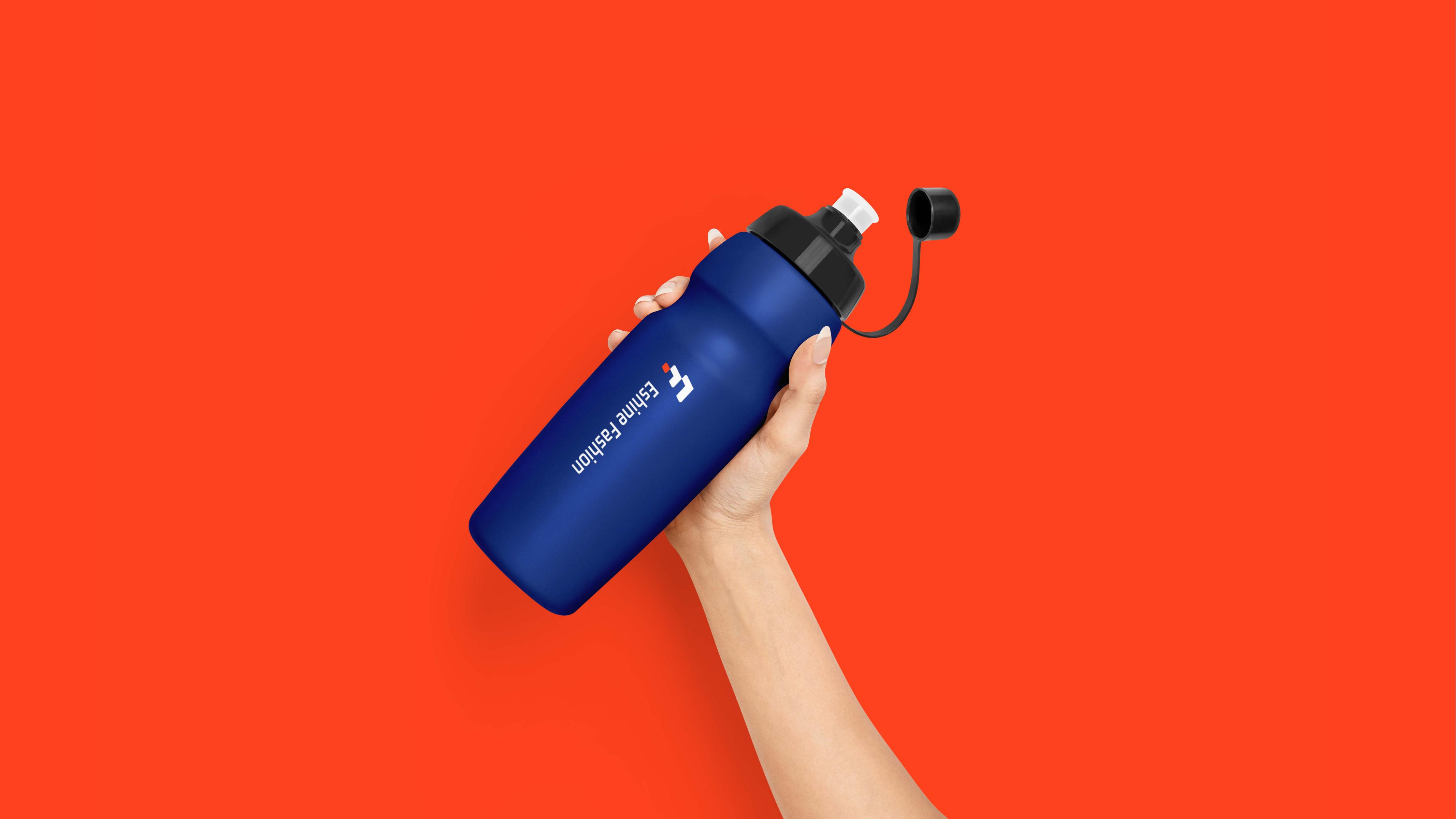
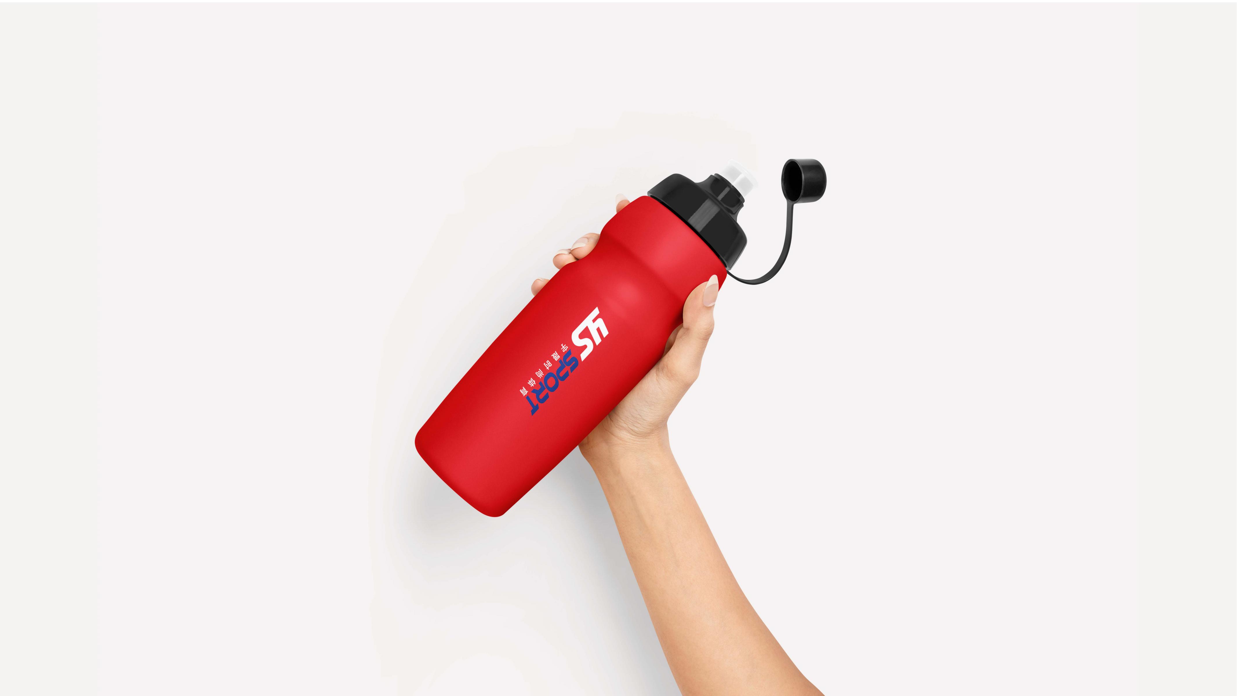
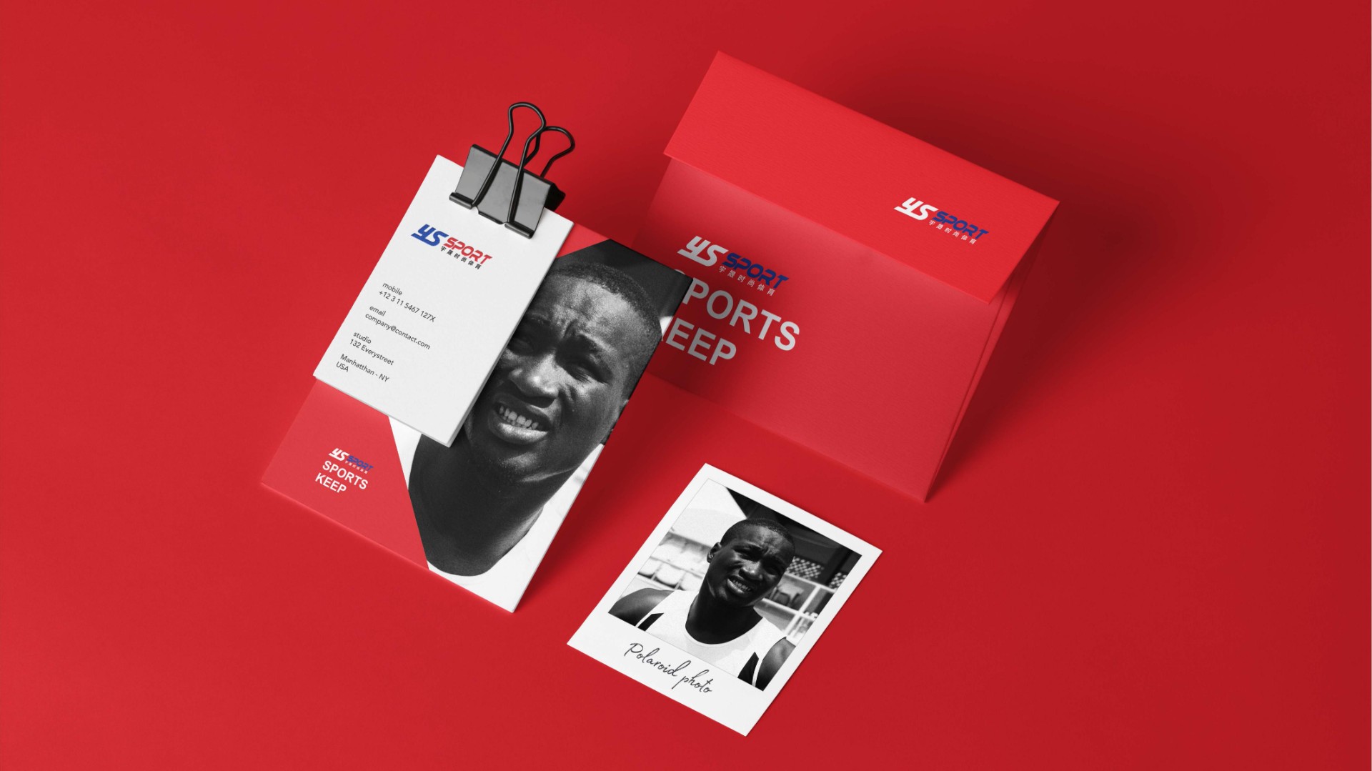
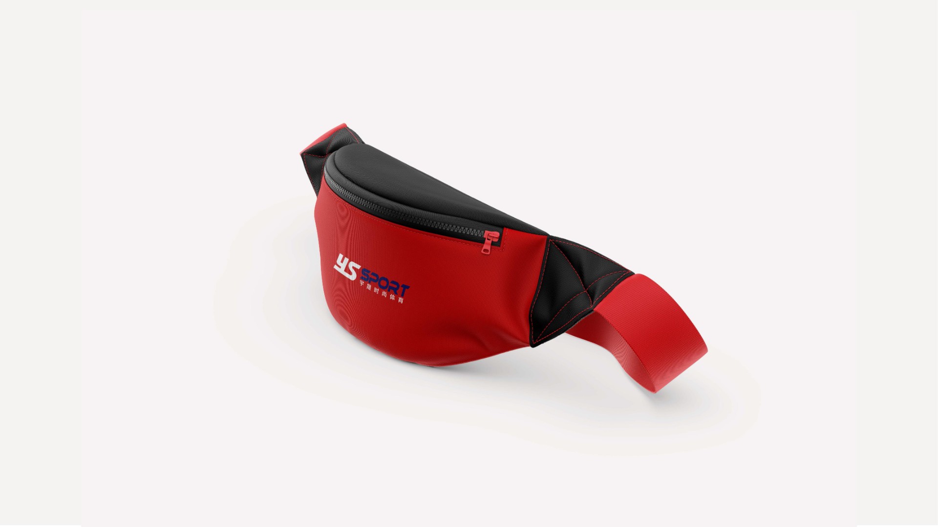
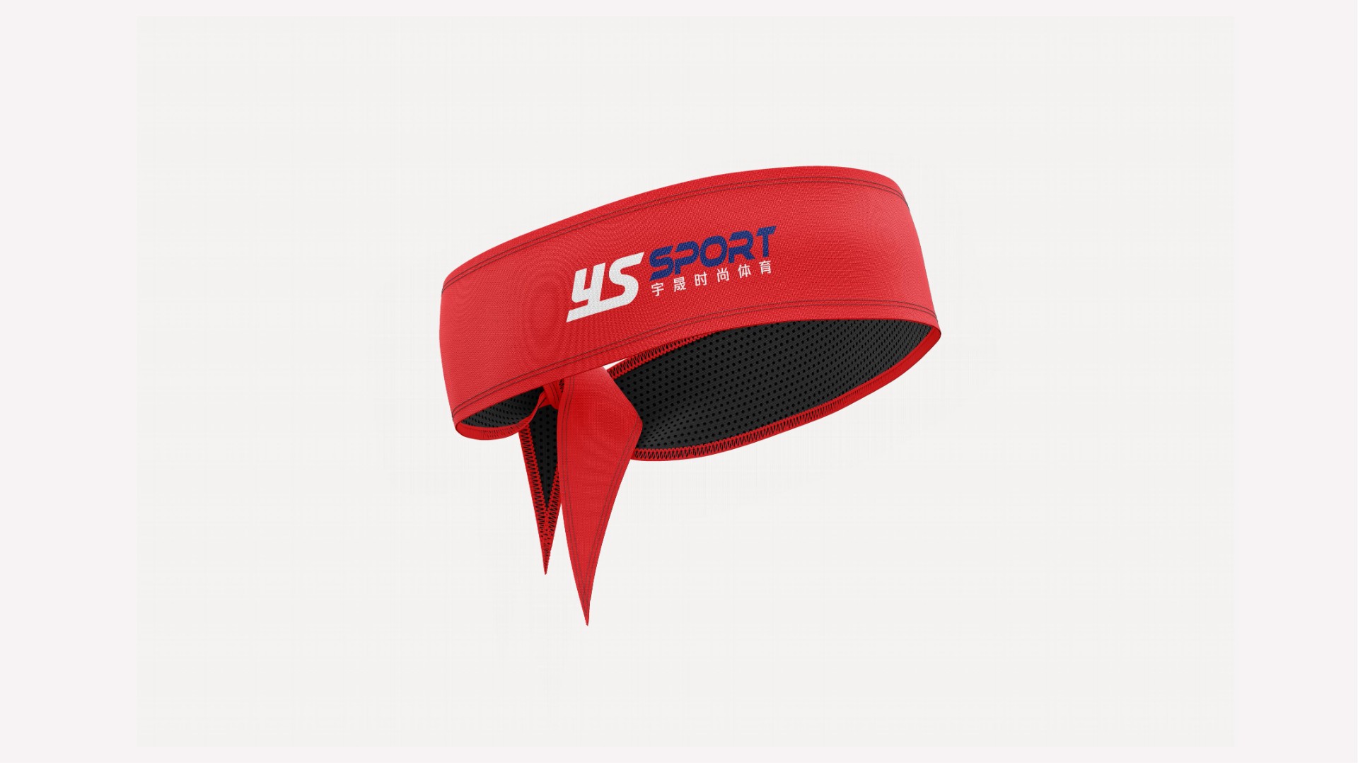
以企业名称首字母“YS”为创意出发点,2 0°的倾斜设计表现动感,凸显体育用品的行业特征 。采用全英文体设计彰显国际化且大气。

Services
Project team
Project Leader:Vicky
Chief Designer:Vicky
Project members:Jackie Chao


Project achievements
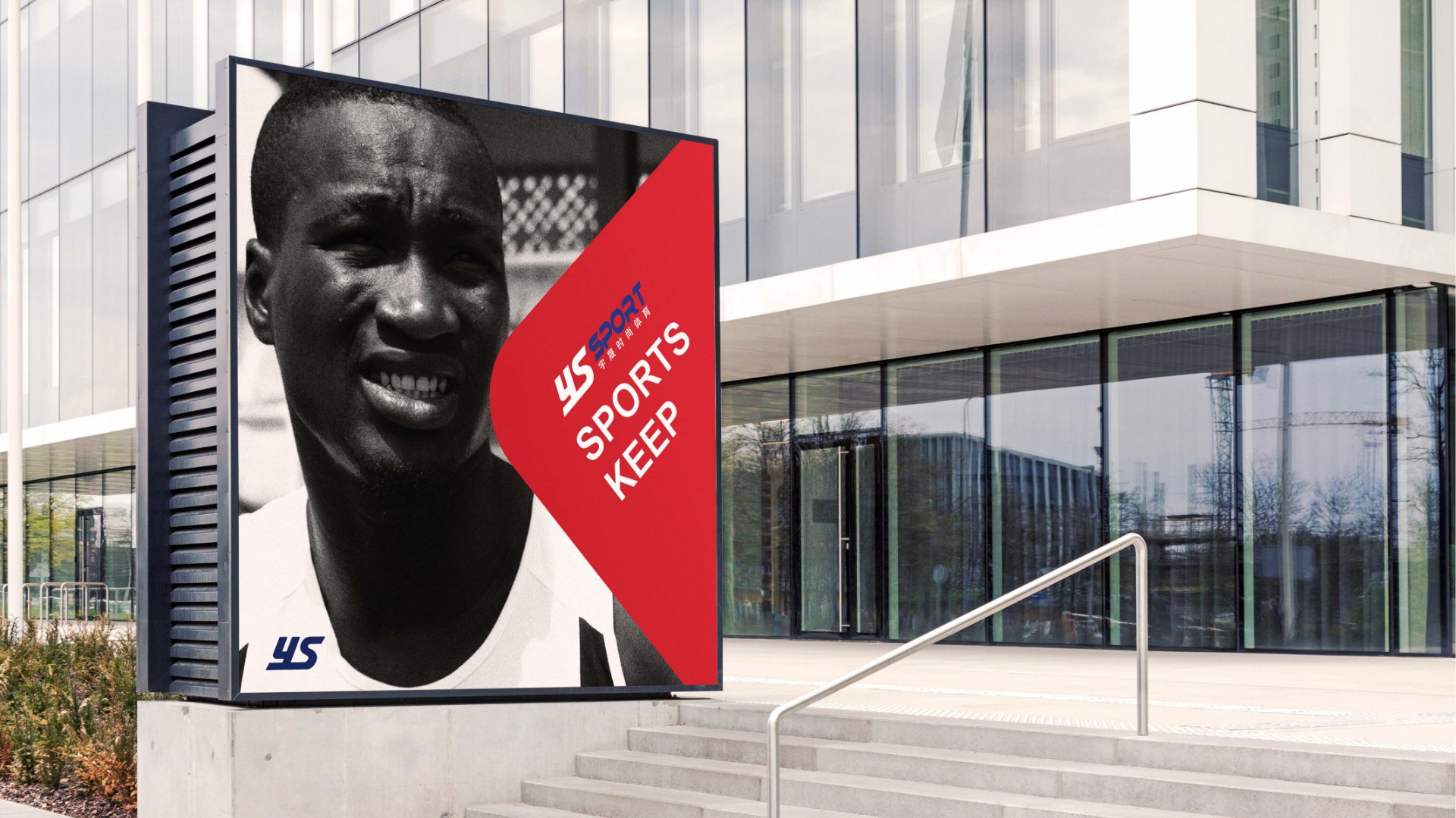
Application display


Customer information
Client
宇晟
Service
Corporate and Brand image building
Time
2022